
For my second project for Jenni Bowlin Studios, I decided to go with some travel pics that I had of my daughter and her boyfriend. These were already printed in 3 X 4 for use with Project Life, but I ended up using other photos instead of these. I had kept these because I knew I wanted to do a layout with them eventually. Looks like that time is now. :)

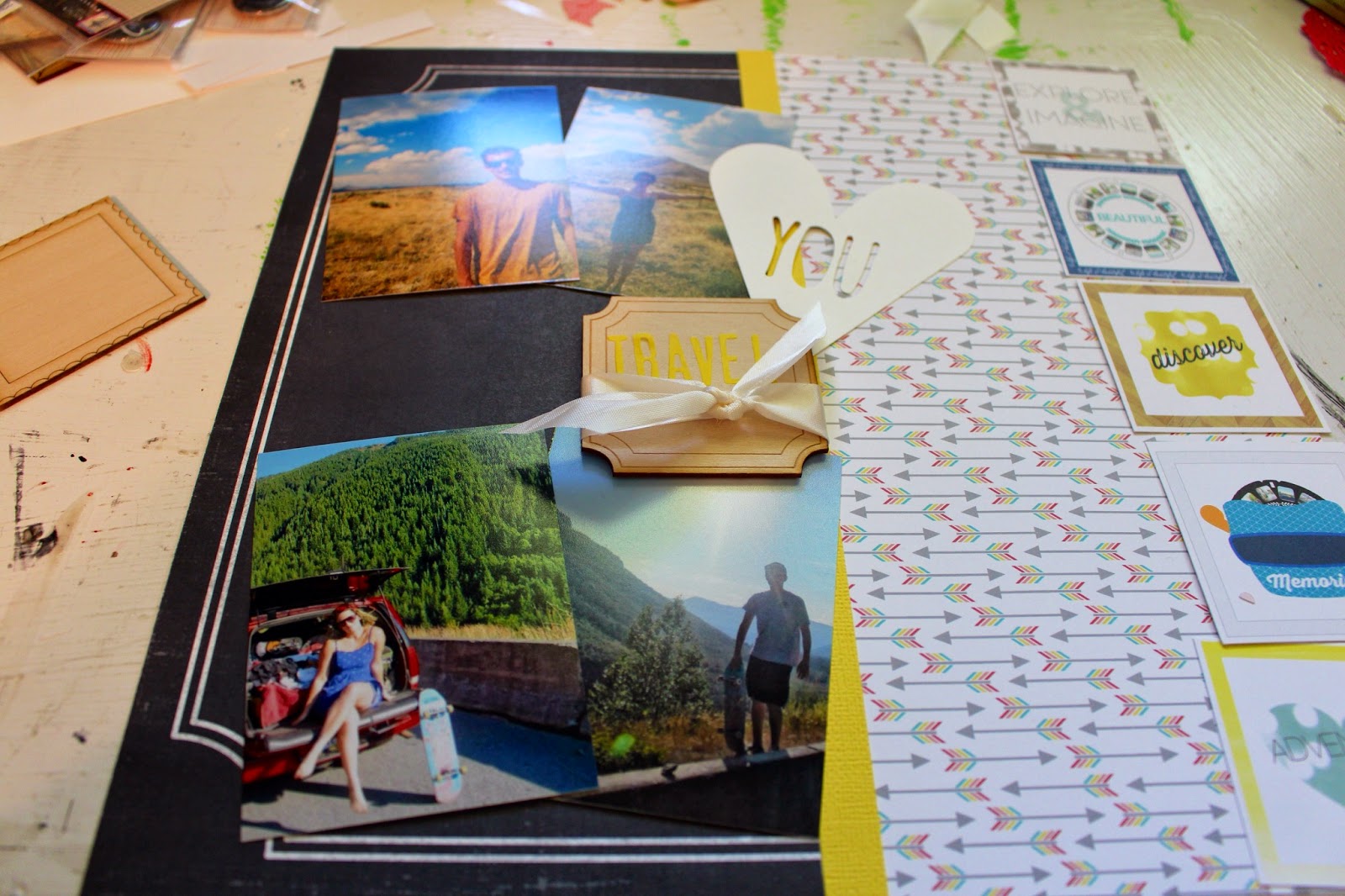
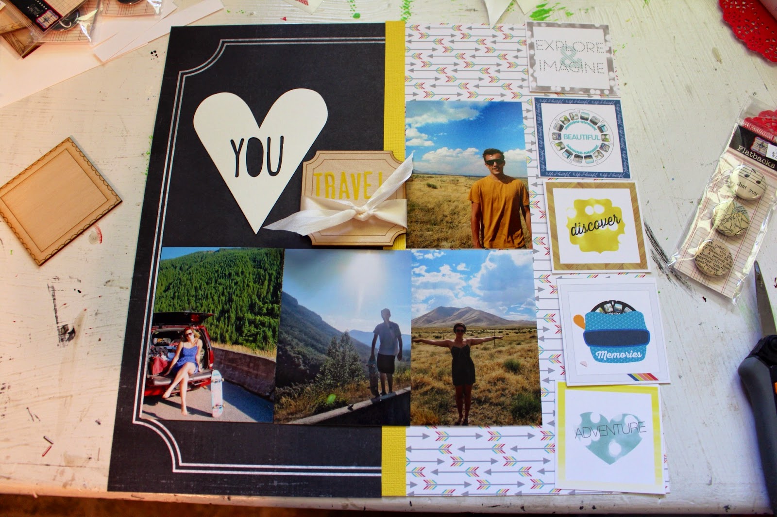
I thought the arrow paper was a great visual to use with travel pics, especially since these pics were all roadside, kind of random shots that aren't about one thing in particular. I also cut apart the square paper because it had references to travel on it, and I thought it'd make great embellishments. I cut those things out and started playing around a little bit. As you can tell, I like to use strips of paper to tie things together, so I used a pop of yellow cardstock to combine the chalkboard paper and the arrow paper. It also picks up the yellow from the square embellishment pieces.

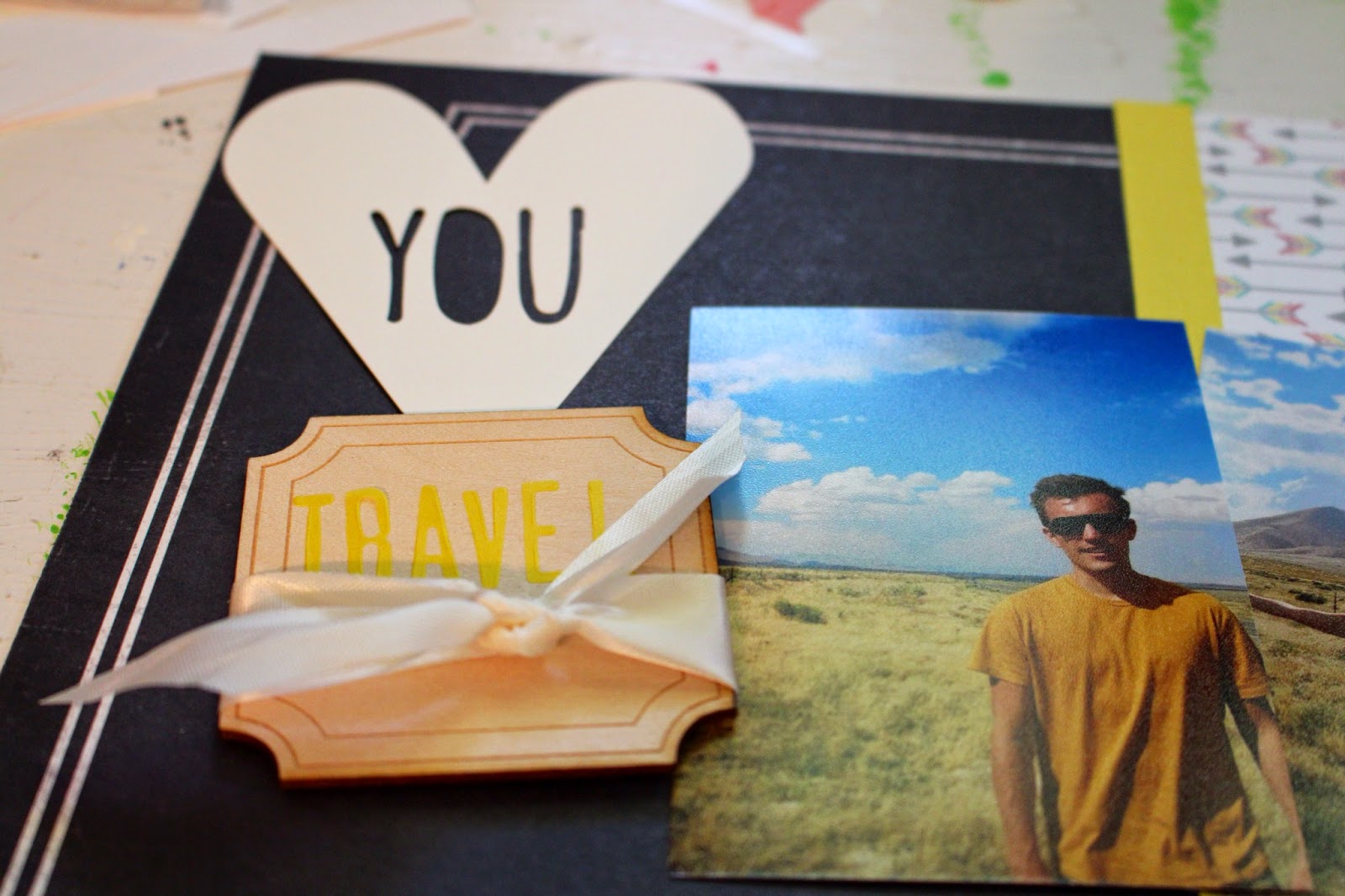
I liked the idea of using the heart shape diecut with You cut out, but I wasn't sure where it would work. I moved it around the layout a few times before making a decision.

I finally ended up using it on the top left of the layout to serve as part of my title treatment. You Travel is really the title of the page.
Yes, this is the layout I like. Guess it's time to start adhering things permanently.

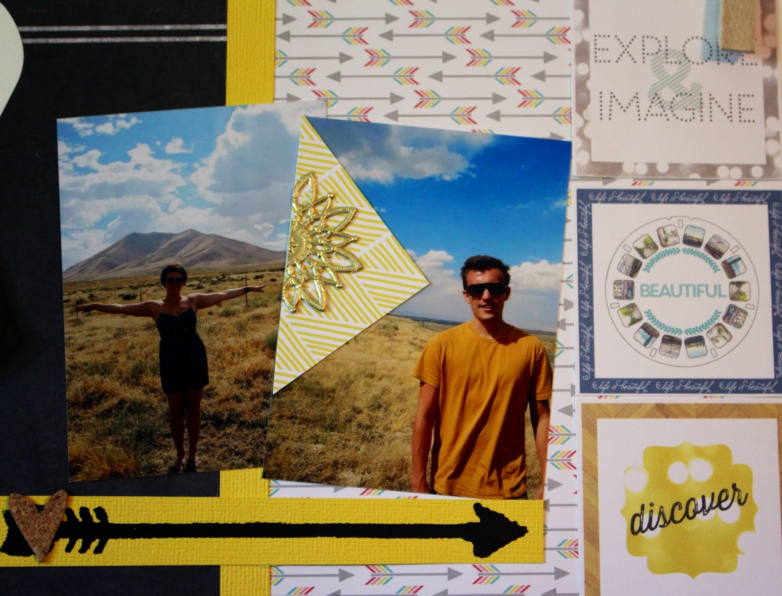
I needed a little bit of journaling space, so I cut some strips of yellow cardstock and wrote on them. The buttons kind of mimic car wheels or skateboard wheels, so I thought that fit with my theme pretty well. I thought the bold patterned cardstock echoed the arrow theme and that the gold diecut pieces looked sort of like suns.

I challenged myself to use a stencil, even though I'm not really comfortable with them. I used black paint with my stencil, but I think I would've liked it better if I'd used ink and a blending tool. Putting that on my shopping list!
Notice that I used some cork hearts to tie together the title treatment and the arrow. I also repeated the buttons under the title treatment to tie it to the buttons with the journaling.
Here's the finished product:

I'll be sharing three more projects this week using items from Jenni Bowlin Studios. Be sure to check them out!
I like how you used the triangle pieces of paper and the gold die cut pieces; it draws the eye to your pictures. I also liked the piece of flair you tucked into the curve of the chalkboard paper.
ReplyDeleteThanks Robin! I thought the triangle yellow pieces kind of looked like arrows, so I'm glad you think they draw the eye. That little corner just needed something, and that flair felt perfect. Appreciate the compliments!
Delete